Projects
Branding a neighborhood: shifting from office campus to everyday destination.
How Proportion and NB Development repositioned Boston Landing from an office-oriented campus into a neighborhood people choose to visit.
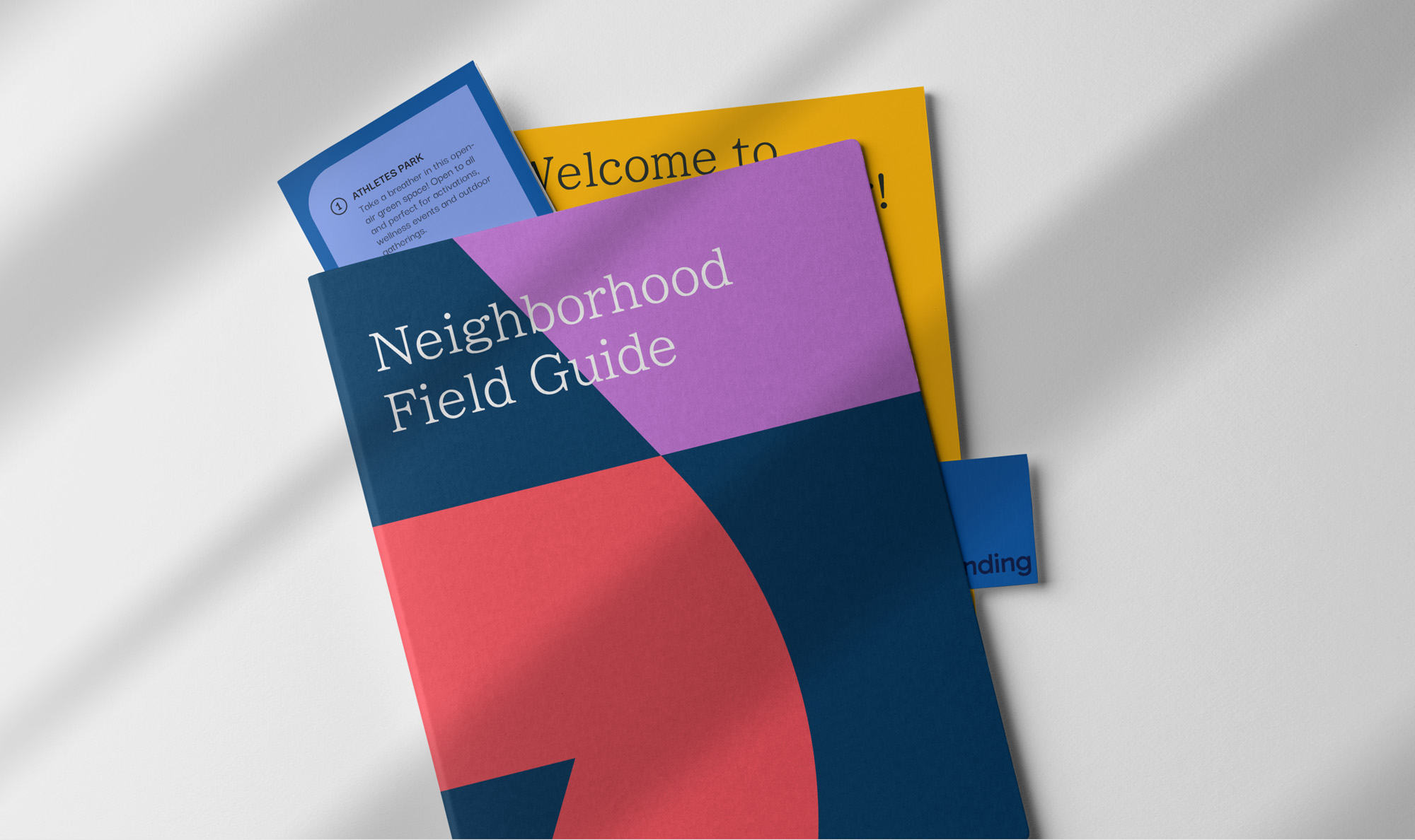
A district brand isn't a logo on a banner. It's a support system for the businesses and residents inside it, a promise to every visitor about what to expect, and a megaphone for everything already happening there.
Get it right and a brand gives a place momentum. It tells people why to come, gives tenants a reason to sign, and turns a collection of buildings into somewhere people herald. Neighbors start showing up to the same events. Businesses start sharing an audience instead of competing for one.
Get it wrong and the place stalls. An identity built for a singular moment in time, talking to an audience that has already moved on. Storefronts sit empty, events feel like one-offs, and a district with everything going for it stays a place people drive past.
Boston Landing, with the Bruins, Celtics and New Balance's headquarters, an internationally renowned indoor track facility, a concert venue for top touring acts, and much more, had established itself as a global destination. Its brand, though, didn't reflect that. It was built to lease office space, before the neighborhood discovered itself.
The Place: A Boston Neighborhood That New Balance Built
New Balance has been part of Allston-Brighton for decades, and rather than move, it chose to grow in place. Its real estate arm, NB Development, turned 15 acres of old manufacturing buildings along Guest Street into a mixed-use district with performance at its core: a new global headquarters, practice facilities for the Bruins and the Celtics, and the TRACK at New Balance, a venue built for everything from championship meets to trade shows.
The energy, the community and the range of experience, from elite athletes training to neighbors grabbing coffee before a concert, were all there. The brand just wasn't telling that story.
The most effective neighborhood branding doesn’t invent a personality. It reveals one that already exists.
A Mixed-Use District That Outgrew Its Corporate-Feeling Identity
The 2016 identity did its job: it sold the development and the office space buildout.
With the TRACK, Roadrunner, residential buildings, an upcoming hotel, and a growing lineup of restaurants and shops, Boston Landing was outgrowing its visual identity.
Our audit found two identities living side by side:
The official one: Corporate blue, a blocky mark, "Life Works Here." Built for a leasing brochure, and quiet after 5pm.
The unofficial one: A social feed trying its best to win a new audience with arches, starbursts and a wide range of fonts. Energetic, but not recognizably anyone's.
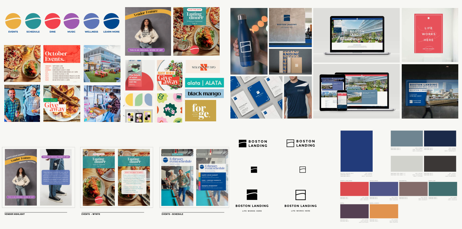
Two disconnected brands meant neither built recognition with the right audience. The brief from NB Development was to reposition Boston Landing as a hub for wellness, innovation and entertainment. The goal wasn't just a logo. It was giving a face and voice to a neighborhood that hums seven days a week, not just weekdays from 9 to 5.
The Neighborhood Branding Process Starts with People
We began with people, not pencils. Before anyone sketched a mark, we got to know who was already visiting and who we wanted to come.
For Boston Landing, the primary archetype we identified was what we called the 'Dynamic Doer' - someone seeking experiences that enrich their mind and body, moving fluidly between planned and spontaneous activity, always oriented toward getting out and active.
They fell into two groups:
- Focused: people arriving for a specific reason, from track meets and concerts to corporate meetings and summer camps.
- Exploring: people more loosely visiting the neighborhood, browsing retail, dining and events.
The strategy: use the focused crowd as the way in, then grow the exploring one.
Three Cornerstones. One Coherent Neighborhood Brand.
Every neighborhood and master plan we brand is built on a few principles specific to that place, and every decision answers to them. For Boston Landing, we distilled the place into three cornerstones:
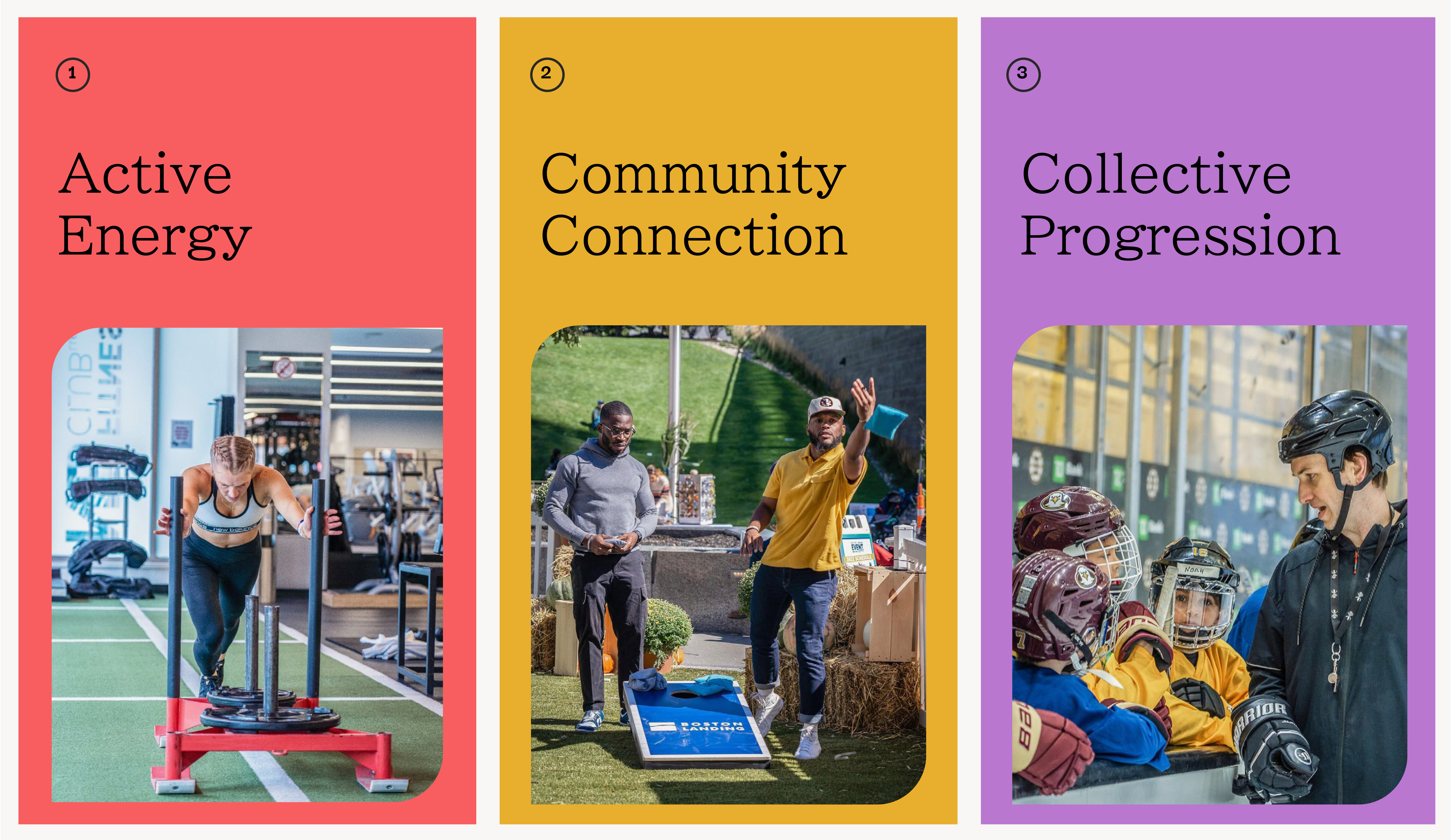
Active Energy. The neighborhood hums with a collective pulse, spanning elite athletes and ground-breaking minds at work through to dog walkers and Sunday strollers. Our job is to support, enhance, and amplify that energy, not manufacture it.
Community Connection. Every public space, every programming decision, every business in the mix is in service of one goal: genuine connection across a genuinely diverse neighborhood. This is what separates a district from a collection of real estate.
Collective Progression. A neighborhood is a sum of its parts. Boston Landing’s brand reflects the conviction that collective momentum, across tenants, visitors, residents, and operators, produces more than any individual focus can.
These three cornerstones form what we call the proportion triangle, a tool that positions the brand in relation to all three values simultaneously and ensures that no single dimension starts to dominate at the expense of the others. Every later choice, from a typeface to a photo shoot, is gauged by where it sits in that triangle.
Potential Energy: A Brand Concept Direction Rooted in Purpose
We called the concept Potential Energy. Boston Landing isn't a destination in the conventional sense. It's a launchpad: people arrive for a specific purpose, then branch out to explore. The brand's job is to set them in motion, and the tagline 'Landing here is just the beginning' does exactly that.
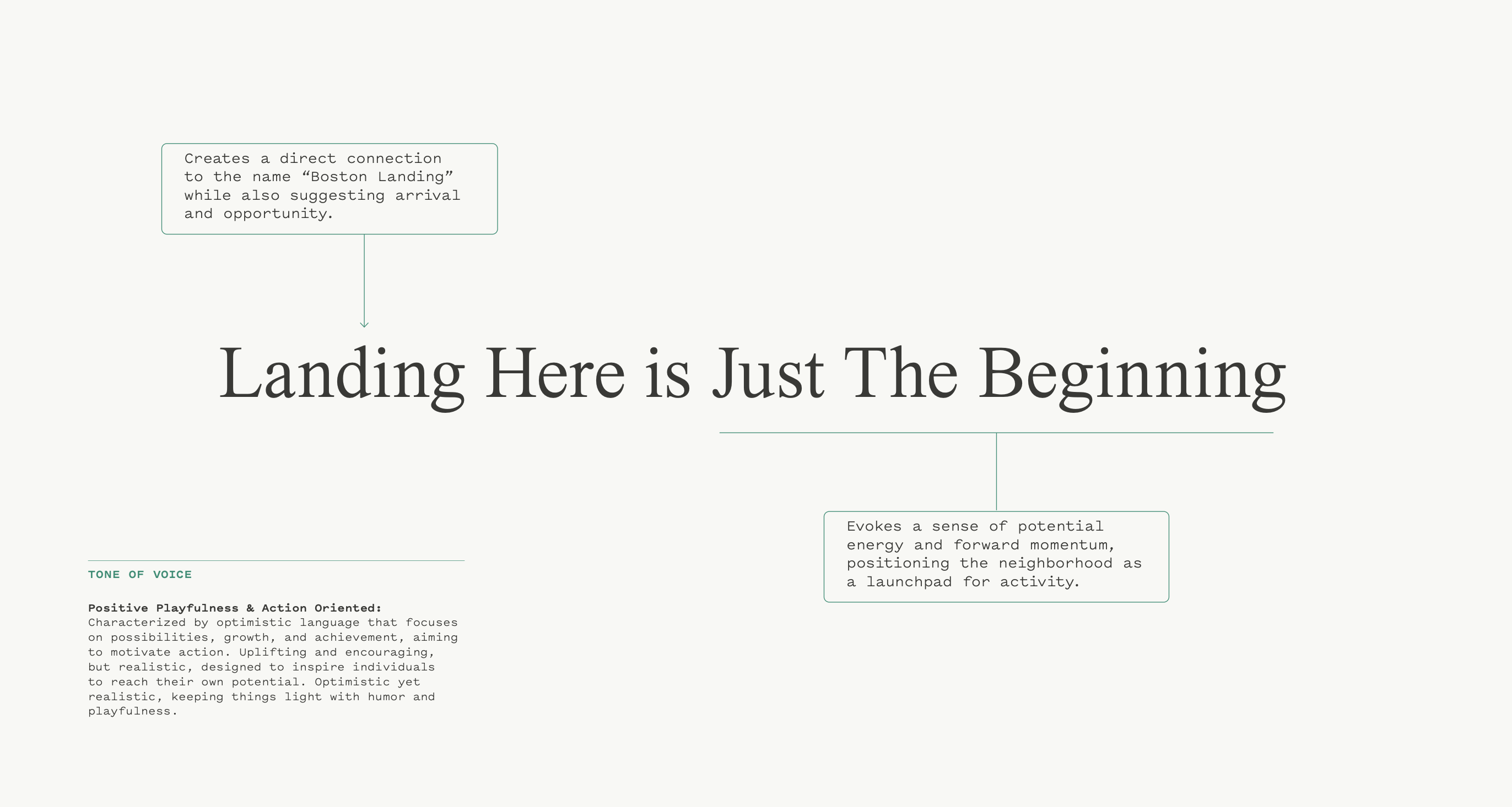
It turns the "Landing" in the name into a jumping-off point and puts the word "go" in the reader's mind without having to say it.

A Visual Identity Rooted in the Neighborhood’s Own Architecture
The original logo's arc, drawn from the district's buildings, carried real brand equity. Elkus Manfredi Architects designed the NB headquarters, Warrior Ice Arena, the Auerbach Center and the TRACK, giving the district a skyline you can pick out from the Mass Pike, which carries roughly 220,000 vehicle trips a day. Few neighborhoods get a billboard that big built in. The interplay of rectilinear forms and flowing lines is central to that skyline, so we built the new mark around it, evolving the old arc rather than erasing it. The result feels like Boston Landing growing up, not a stranger moving in.

The new logo does something we consider essential in branding a physical place. It connects without being literal . The outer forms of the icon create an abstracted B; the negative space forms an L. The curves in both the letterforms and the icon echo the signature arc of the New Balance headquarters and the broader architectural language of the district. The result conveys forward movement and active energy without tipping too athletic.
The color system moved away from corporate blues and grays. The new palette pairs navy and light grey as a primary foundation with a rich supporting system of red, purple, yellow, green, blue, and periwinkle, each color assigned to a specific content category and applied consistently across the website, signage, event communications, and social media. The practical effect is a neighborhood that is visually navigable as well as visually distinct.

More Than a Tagline: A Narrative Framework for Campaign.
We did the part most taglines skip. We turned the line into a system anyone could write with, built on a rhytmic "From X to Y" structure celebrating the neighborhood dichotomy. Alliteration (From the elite to the everyday), rhyme (from tasty bites to movie nights) contrast (from solo workouts to sold-out shows) and word repetition (from high jumps to high hats) all fit the pattern, with the tagline wrapping it up as the launch moment.
From fitness to festivals, landing here is just the beginning.
Placemaking in Practice: Where Brand Is Made Real
A neighborhood brand proves itself in action, not in presentation. We built it for every place someone might meet it.
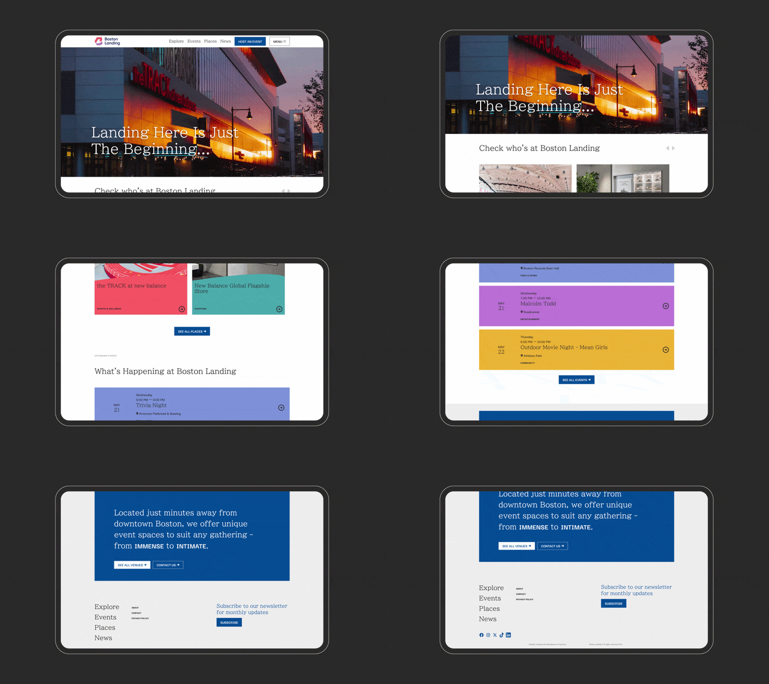
A Website Designed for People, Optimized for Robots. The website was rebuilt as a dynamic neighborhood hub: a color-coded event calendar, a filterable interactive map of the district, and a rotating call-to-action system built around the messaging framework. It's also built for search, which matters more every year for any district competing for organic discovery.
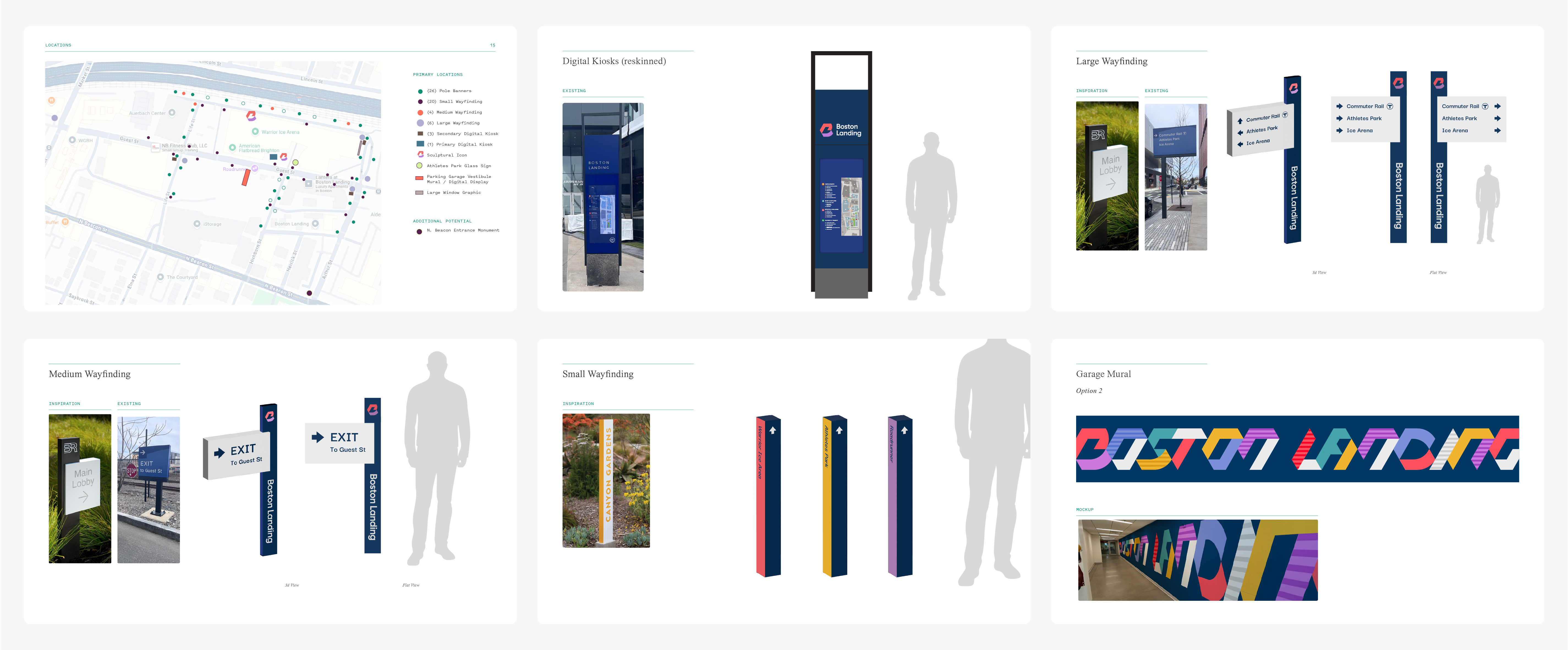
A Signage System That Unifies a Set of Buildings into a Campus. The environmental signage system spans pole banners, small and large directional structures, digital kiosks, large-format window graphics, and garage vestibule displays, creating a legible branded journey from the MBTA Boston Landing stop along every street in the district. The brand isn't applied to the neighborhood. It's woven into it.
A Toolkit Built to Outlast Us. The social media system, the monthly newsletter, the Instagram post and Stories templates, the print advertising, and the venue showcase passport all operate from the same visual and verbal foundation. The extensive guidelines and templates help keep the brand consistent and thriving while multiple teams continue rolling it out.

The Outcome: A Neighborhood People Celebrate
The brand started rolling out in 2025, with increased awareness and activity. Social media audience increased 208% with 59% more engagement in 2025 from the year prior. New brand partnerships increased, including Athletic Brewing, Celsius, Long Drink, Sweat Houz (SWTHZ), and Trader Joe's.
The numbers moved because the brand was built on what was already true about the place. Neighborhood branding at this scale is, at its core, an act of stewardship. The brief isn't just to look strong at launch. It's to build something that holds up over time and adapts as the neighborhood continues to define itself.

Check out more of our work with
Boston LandingDiscover more Proportion